Identity System
The mark of the studio.
A complete identity system built for permanence — the monogram, wordmark, colour field, and typographic rules that represent HS Kitchens Studio across every surface.
01 — Symbol Mark
The HS Monogram
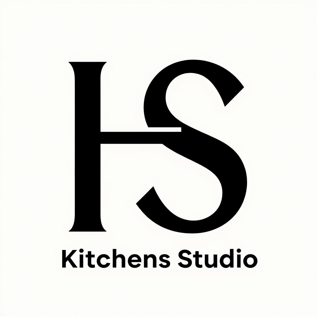
The mark unites H and S within a precise square field — a nod to the grid that governs architectural drawing and cabinet-making alike. A single thin shelf line at the base recalls the datum from which all joinery is measured.
02 — Logo Variations
Three lock-ups
On Light
On Dark
On Gold Accent
Icon / Favicon (32 × 32)
03 — Wordmark
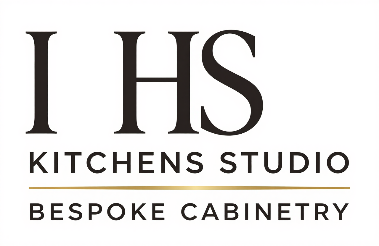
Full wordmark
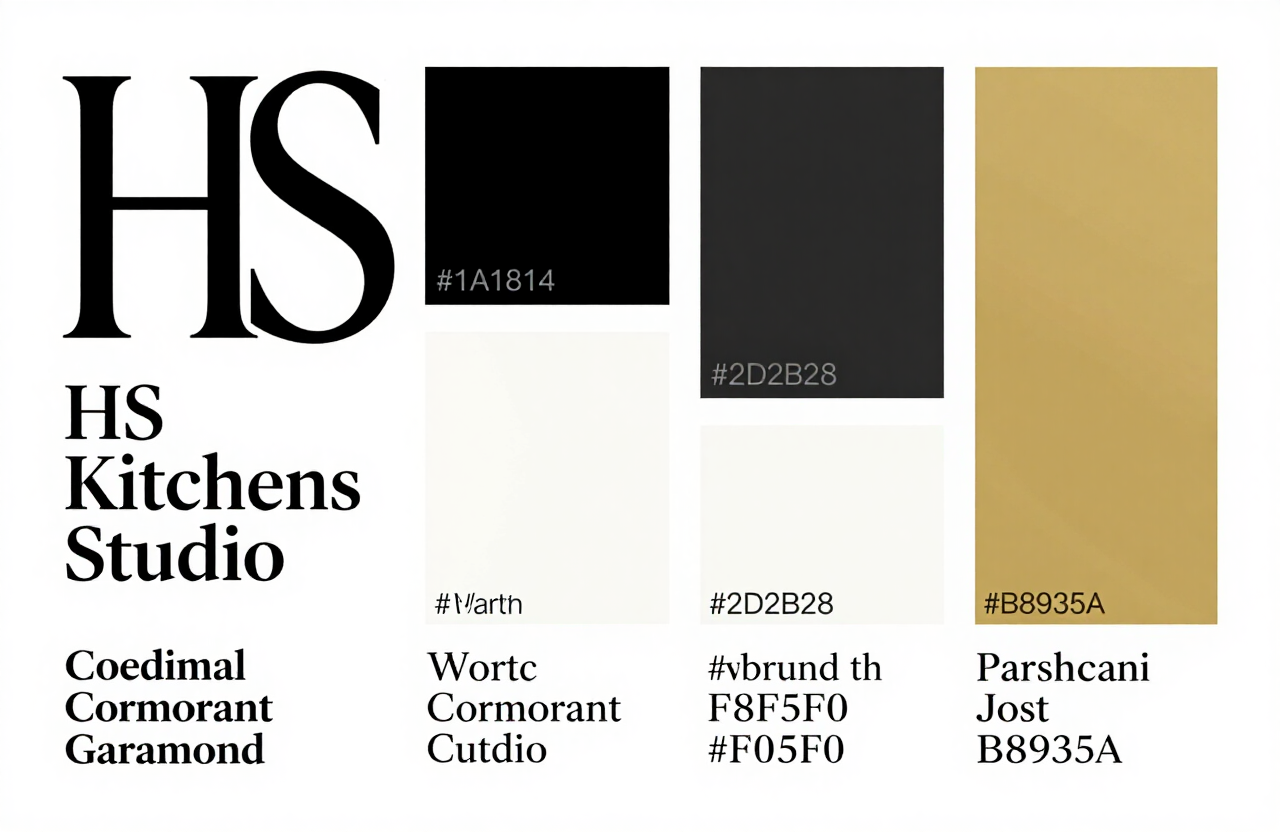
04 — Colour Palette
Six materials, one field
The palette is drawn from natural materials: charred timber, aged limestone, burnished brass. No digital primaries; every tone is warm and mineral.
Ink Black
#1A181430 10% 10%
Primary text, symbol mark
Charcoal
#2D2B2830 8% 17%
Secondary text, body copy
Warm White
#F8F5F038 24% 96%
Primary background, reversed logo
Limestone
#EDE7DC38 20% 89%
Section backgrounds, cards
Brushed Gold
#B8935A34 37% 53%
Accent rule lines, highlights
Aged Brass
#9A7B4634 40% 44%
Deep accent, watermarks
05 — Typography
Two families, one voice
Display / Brand
Cormorant Garamond
Where craft becomes character.
Hero headlines, pull-quotes, wordmark, editorial display
Body / UI
Jost
BESPOKE CABINETRY
Body copy, navigation labels, captions, small caps
Type scale
The studio
Twelve commissions
Materials & Process
Where craft becomes character and every detail is considered.
Designed and crafted for homes throughout Queens, New York.
BESPOKE CABINETRY · LONDON
06 — Space & Size Rules
Minimum size & clear space
Clear Space
Maintain a clear zone equal to the cap-height of the wordmark (or half the symbol height) on all sides. No other graphic element, type, or image may intrude this field.
Minimum Sizes
07 — Usage Mockups
The mark in the world
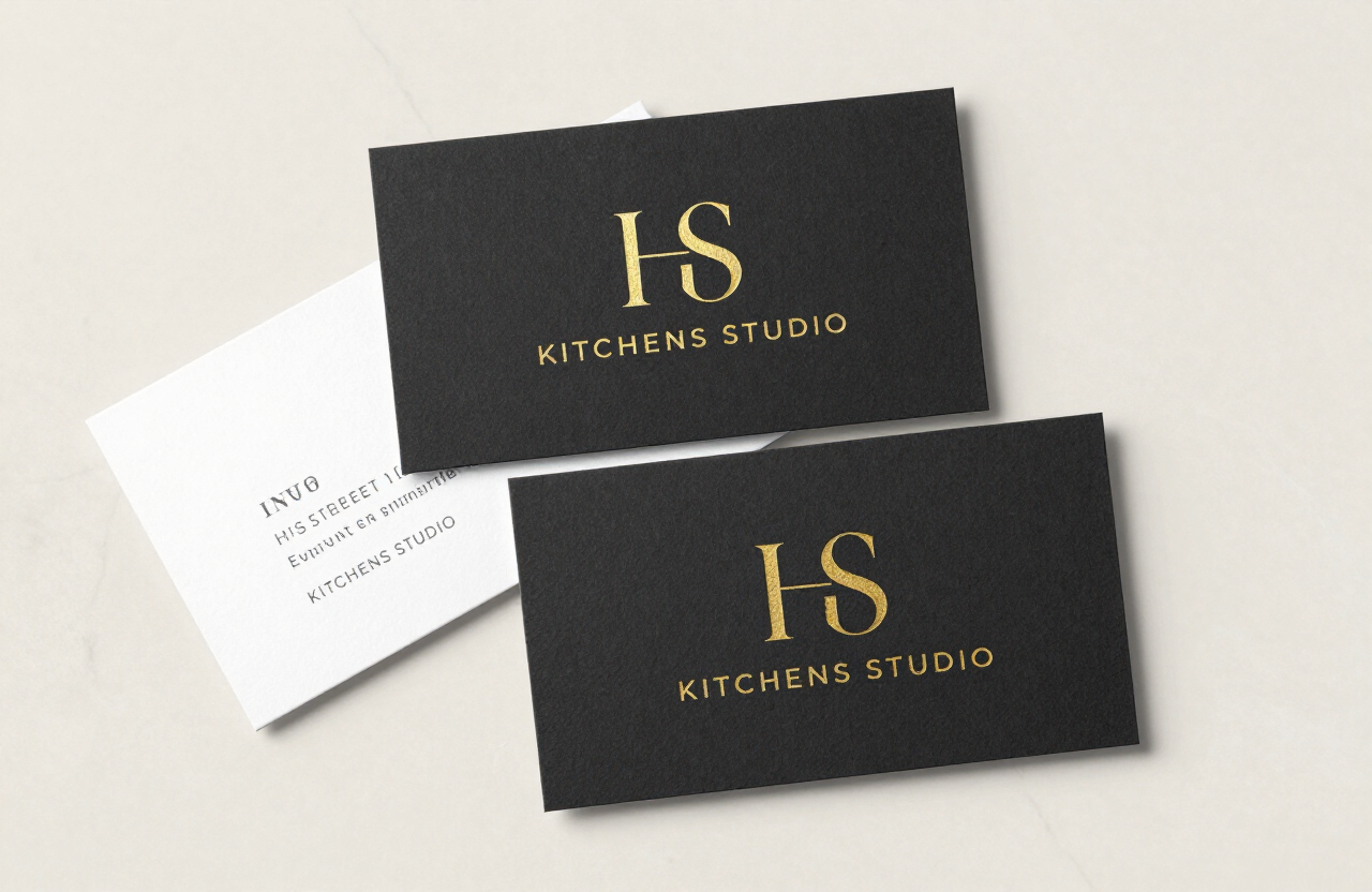
Business Card
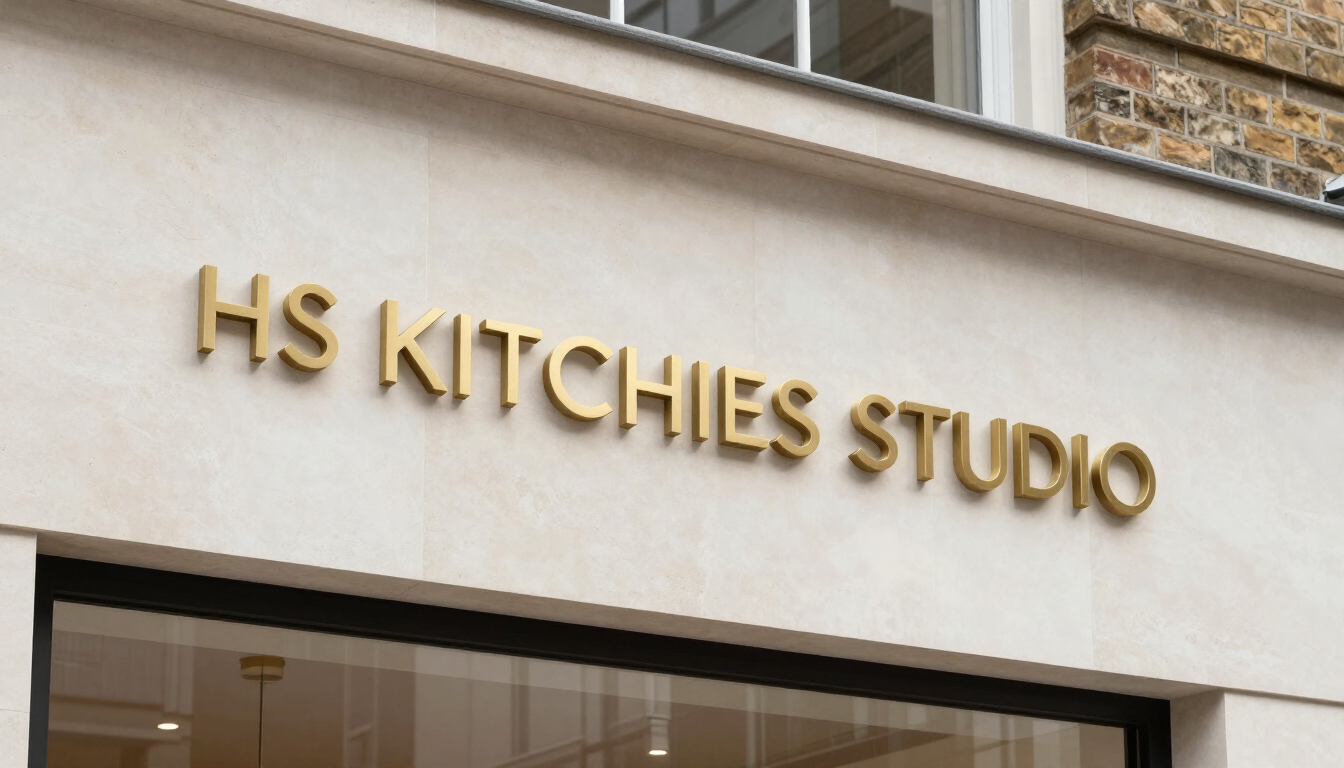
Studio Signage
Brand Identity System Reference
Website Header Application
08 — Usage Rules
What we protect
Never stretch or distort
The aspect ratio of both mark and wordmark is fixed. Resizing must be proportional.
Never change the colours
Use only the six approved palette colours. No RGB primaries, brand gradients, or unapproved tints.
Never add effects
No drop shadows, outer glows, bevels, or emboss effects on digital applications.
Never use on low-contrast
Confirm WCAG AA contrast before placing the mark. Minimum contrast ratio 4.5:1 for text elements.
Never rearrange elements
The mark, rule line, and wordmark hierarchy are fixed. No reordering, resizing of parts, or substitution of typefaces.
Never use alone on photography
Always apply the mark on a solid or tinted overlay. Direct placement on busy photography is not permitted.
Where craft becomes character.
For brand assets, co-branding requests, or press enquiries — contact the studio directly. All identity files are provided in SVG, EPS and PDF formats.
Request Brand Assets